Creating a Dashboard
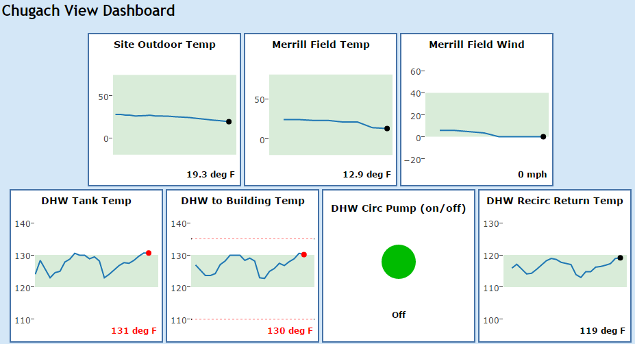
A dashboard provides an easy-to-understand display of the current values from key sensors in a building. Here is an example:
This document explains how to create Dashboards. You can create one Dashboard for each building in the BMON system. Any or all of the sensors associated with the building can be displayed in the Dashboard.
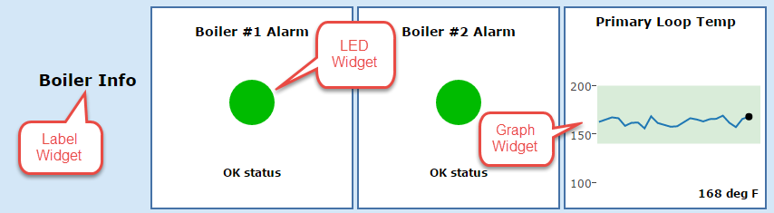
This screenshot shows the three different types of Dashboard Widgets:
To create a Dashboard for a building, log into the Admin interface and navigate to the screen that allows you to edit or configure the building. More details are provided in Add Buildings and Sensors but the basic steps are:
Go to the main Home screen for the Admin Interface by clicking the
Homelink in the upper left corner of your current screen.Click the
Buildingslink in the left column of theHomescreen.Click on the Building that you wish to add the Dashboard to.
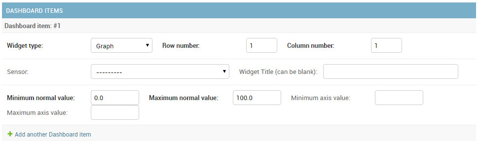
At the very bottom of the edit page for the building should be a section for Dashboard items and the first blank Dashboard item is shown:
A Dashboard is made up of individual Widgets arranged in rows and columns. For the sample Dashboard shown above, there are three Widgets in the first row (three Graphs), and four Widgets in the second row (an LED and three Graphs). So, to create this Dashboard, you would need to enter seven different Dashboard items for the building.
A blank Dashboard item is provided to start, and additional items
are created by clicking the Add another Dashboard item link at the
bottom of the page. When finished entering items, click the Save
button for the Building found in the lower right corner of the page. If
you would like to save your work before finishing all Dashboard items,
click the Save and continue editing button, which will leave you on the
editing screen.
Here are sample inputs for a Graph Widget:
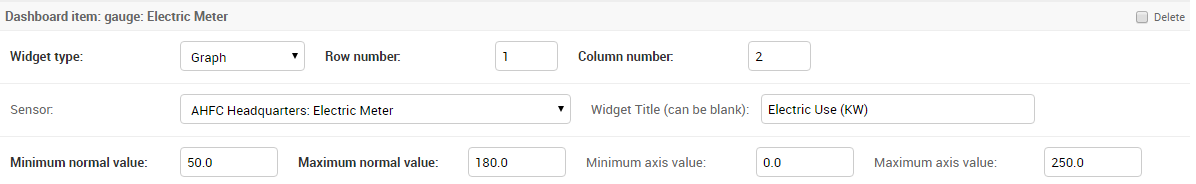
The Widget Type input is a dropdown showing the three different
Widget types, Graph being the selection here. Next, you need to
specify where this Widget is to be located in the Dashboard. Row and
column numbering starts with 1, and this Graph is to be located in the
second column of the first row. It is best to sketch out your Dashboard
before entering values so it’s easy to determine row and column
locations of the Widgets.
Next, the Sensor that you wish to display in this Graph is selected in
the Sensor dropdown. If you want to title the Graph with something
other than the Sensor’s title, you can enter the new title in the
optional Widget Title box.
If you look at the pictures of the Graph control (the first image in this document), you see that a
portion of the vertical scale is colored Green. The Green area
designates the normal range of sensor values. You enter the normal range
by filling in the Minimum normal value and Maximum normal value
inputs for the Dashboard item. For this example, the normal range goes
from a minimum value of 50 kW to a maximum value of 180 kW. You will
also note in the pictures above that if the most recent value of the
sensor falls outside the Normal range, the dot on the graph and the
sensor value label are colored Red as opposed to the normal black.
Finally, the Graph Y-Axis has a starting value and ending value. BMON
will make reasonable estimates for these given what you put in for the
Normal range. But, if you want to explicitly specify the full range of the
vertical axis, you can enter values for Minimum axis value and/or
Maximum axis value. In this example, the Minimum axis value is 0 kW
and the Maximum axis value is 250 kW.
In the sample Dashboard at the top of the page, one of the Graphs has two horizontal dashed red lines. These lines indicate that Sensor Alerts have been set to trigger at these values.
Here are sample inputs for the Red/Green LED Widget:
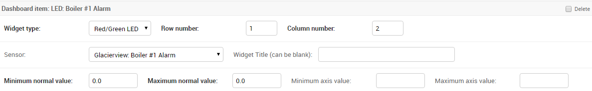
The first two rows of inputs have the same meaning as for the Graph
Widget. The important settings for the LED Widget are the
Minimum normal value and Maximum normal value. If the sensor
value is within this range, the LED will be colored Green. If the sensor
value is outside of this range, the LED will be Red. In this example,
the sensor selected reads a set of alarm contacts on a boiler. The dry
contact sensor reports a 0 when the alarm contacts are open and a 1 when
they are closed and an alarm is occurring. So, Minimum and Maximum
normal value inputs are both set to 0, because 0 is the only value that
indicates no Alarm.
Finally, here are sample inputs for a Label Widget:
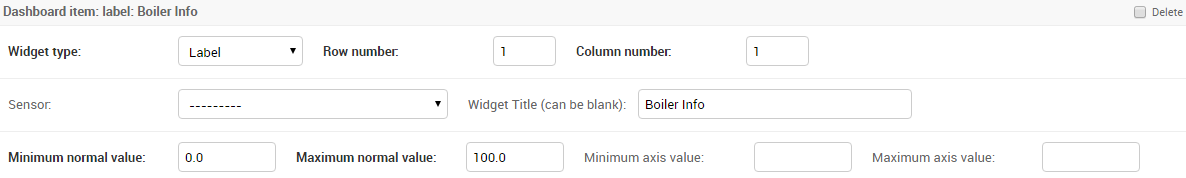
This Widget simply shows a label in the Dashboard; the Widget is not
linked to any sensor. The only inputs that are used are the
Widget type, Row number, Column number, and
Widget Title, which is the label that will be displayed.
To delete any Dashboard items, check the Delete checkbox on the right
side of the inputs for the item (not shown in the image above). Then
click the Save button in the lower right corner of the page. Do
Not click the red x Delete button in the lower left corner of the
page, as that will delete the entire Building, not just the selected
Dashboard items.
If there are any Dashboard items configured for a Building, the Dashboard will automatically be added as the first item in the list of Reports/Charts that a User can select and view for the Building.